Posts tagged with "process"

Black Star Base

The Black Star Maquette I made has been sitting around for a few years in my workspace but there wasn’t a good way to display it. It needed a proper base.

I started by using a clear acrylic Christmas ornament half-dome as a mold. Using baby oil as a mold release, I coated the inside with about a quarter-inch layer of polymer clay (Super Sculpey). Then I packed it with aluminum foil and added a top layer of clay. I took it out of the mold and sculpted the craters and added texture. I used a little lava rock to put gouges into the surface.

After baking the clay, I sprayed it with black primer and then dry-brushed several shades of redish-brown acrylic paint, going from dark to light.

The hardest part was finding a way to straightly attach the acrylic rod that holds the ship. I don’t have a drill press and my hand-drilled hole was a bit crooked. So I made the hole bigger, giving it some wiggle room, and built a jig out of Lego to hold it in place while I epoxied it.

I really like how it turned out.

Painting Gemstones

This is a technique I’ve developed for adding gemstones to a painting.

I took a sheet of watercolor paper and painted a lot of different streaks on it. I don’t remember what kind of brush I used, but it was some kind of flat. I wanted a range of line styles, so I wet the paper in a few places to get more bleed. I also crisscrossed the lines in several places.

Now when I need a gem, I cut it from this sheet. Sometimes I will cut the shape out of a blank piece of paper that I can overlay as a stencil and see what the resulting gem will look like.

After cutting out the shape I glue it onto the painting using a thick acrylic gel medium.

I’ve used this technique a few times and really like the result.

Paint Caps

I save (hoard) plastic milk caps to use for little paint mixing cups. To keep them from drying out while I’m doing a painting I store them in a sealable container with a wet sponge inside. They’ll keep for a few weeks this way.

Black Star Maquette

While working on Space Pirates, I came across a challenge trying to draw the main ship, the Black Star, from different angles, so I decided to build a quick maquette of it. I sculpted it from Super Scupley and cured it in the oven. Then I scribed panel lines, drilled rivet holes, and glued on some washers for portholes. I primed and shaded it, then did the final paint and weathering. It’s very rough but I like how it turned out.

Monsters vs. Robots: Getting to Done

How do you finish a large project? Honestly I don’t know. I have a sizable graveyard of abandoned projects and it’s something I continually struggle with. But here are some of the processes that helped me finish creating Monsters vs. Robots.

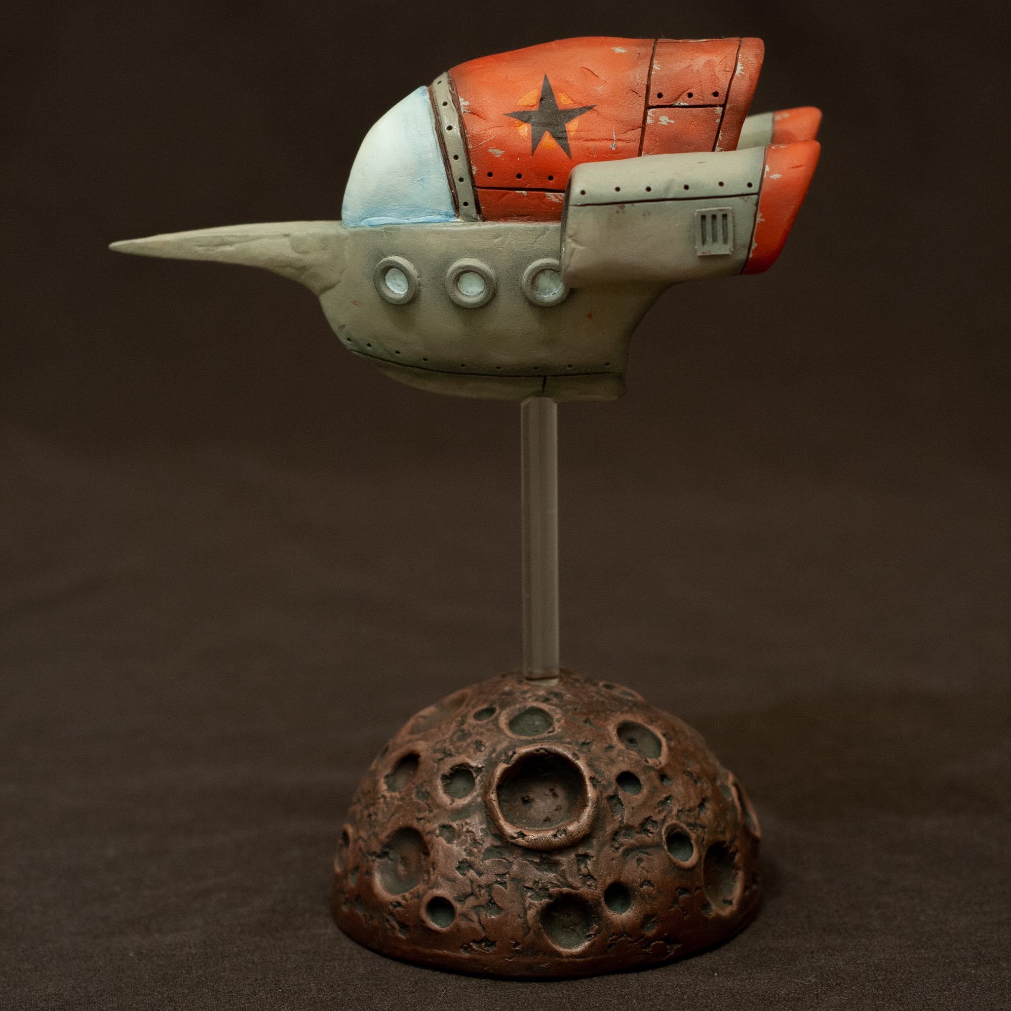
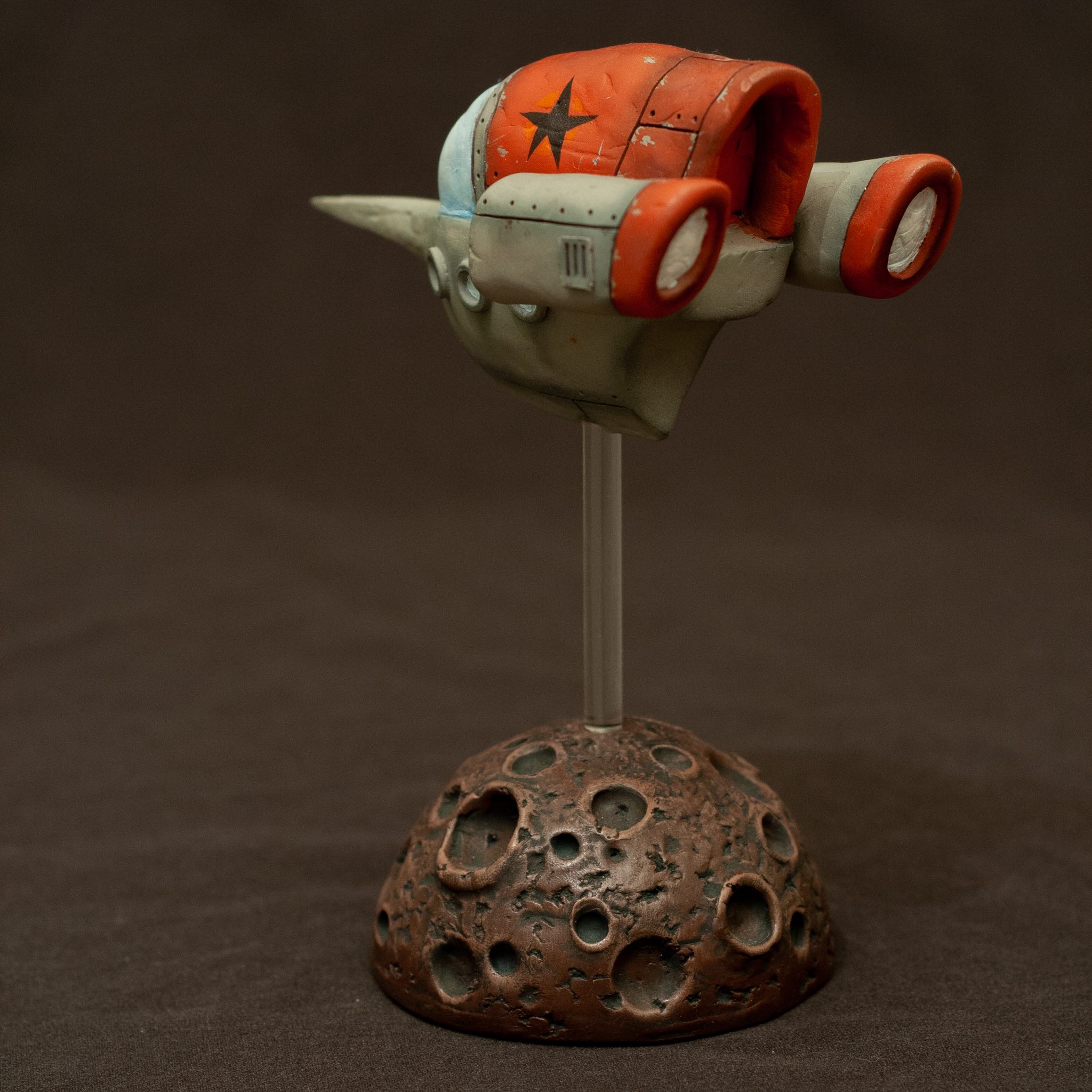
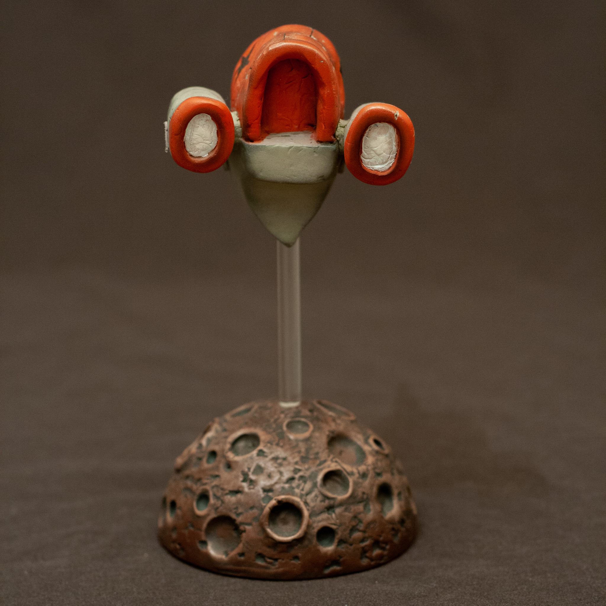
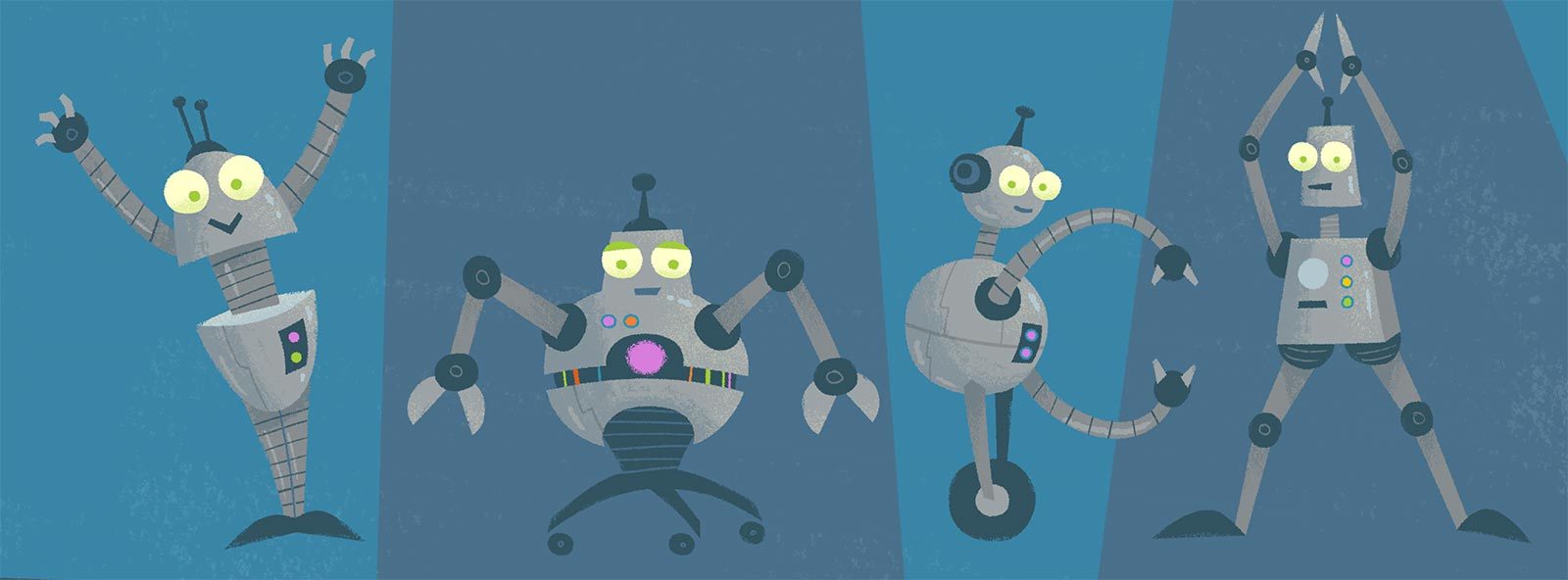
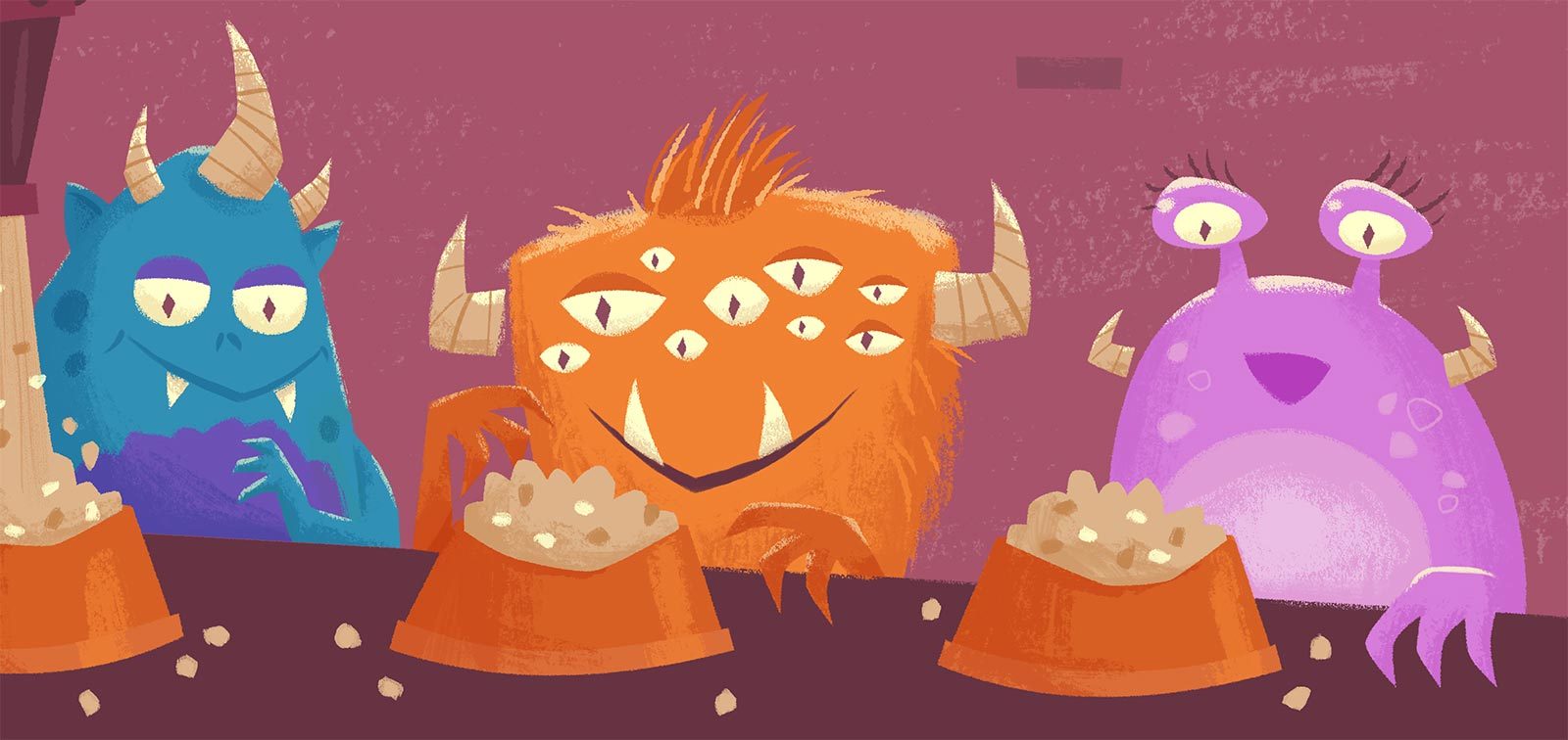
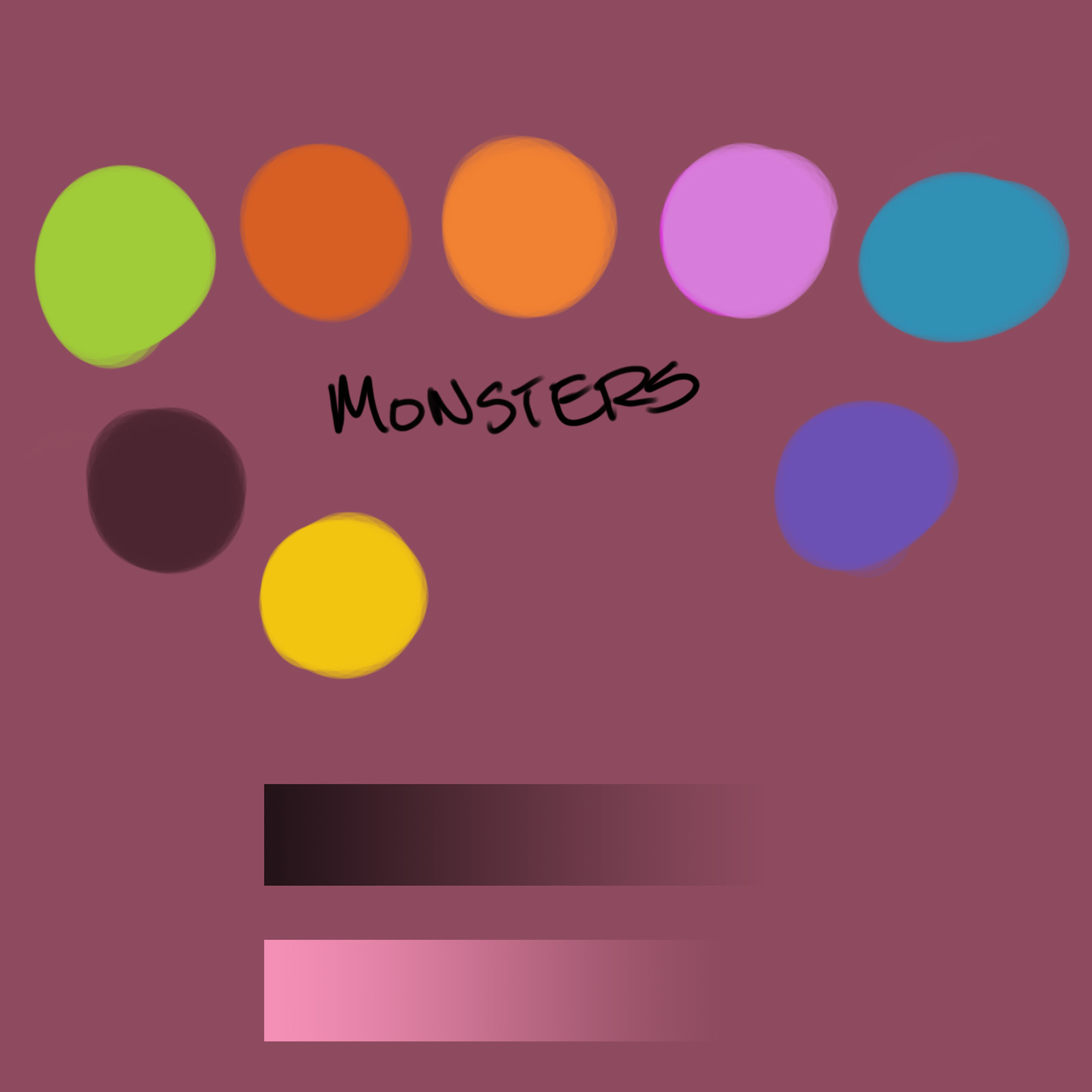
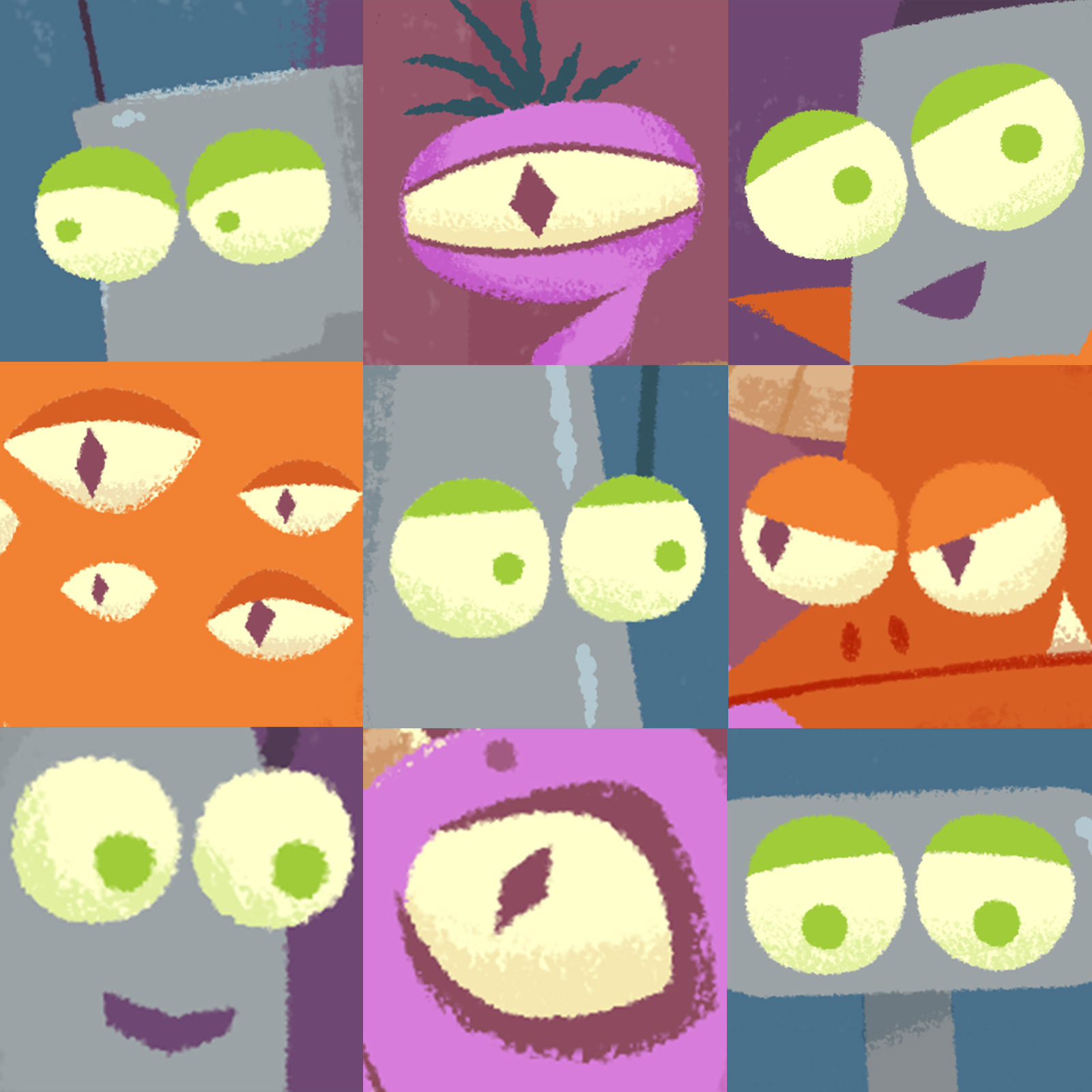
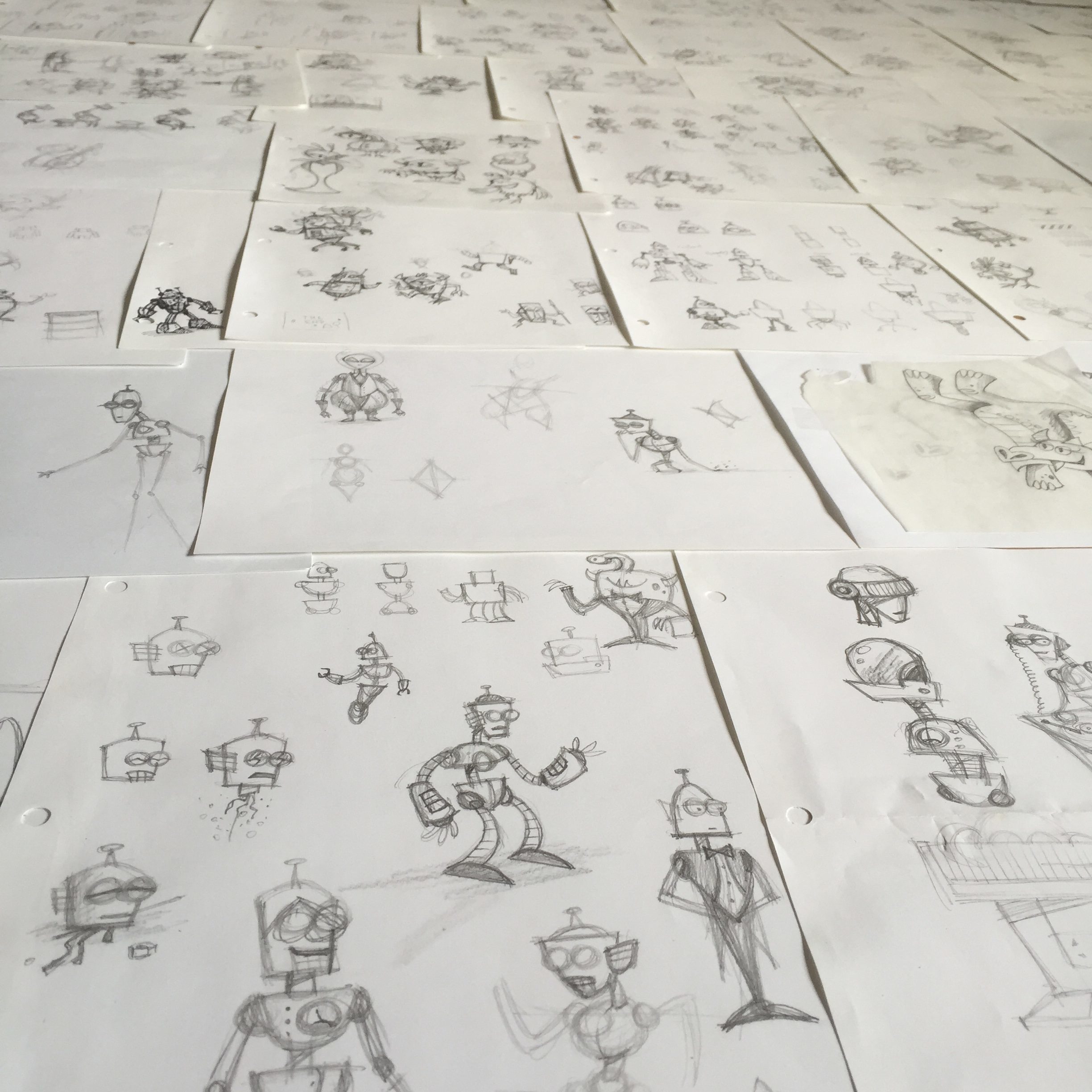
I started by doing sketches of the main characters, Dr. Tinkerton and Dr. Zadok, and I wrote a descriptive paragraph for each of them, comparing and contrasting their physical and emotional characteristics.

I should have done more research on picture book formats and standards, but instead I grabbed a few books off of our shelves and counted the pages. It seemed like anything around 30 pages would do. I wrote a basic outline for the book with a single line describing what the story should do on each page. Similar to:

1: Tinkerton intro 2: Zadok intro 3: Contest setup …

I used this outline to plot the story beats, making sure that it conveyed the dynamics of a complete story – that it introduces the characters, builds tension, and leads to a final resolution.

Then I started writing the story rhymes for each page. For some reason writing in rhyme was a lot easier than writing it in prose. (I don’t think I even tried writing in prose.)

Once I had a rough draft of the story, I laid out all of the pages in InDesign. I created a blank Photoshop file as a placeholder for each page’s illustration and linked each one to its page in the InDesign document. Then I could scroll through the whole book and start filling in the illustration details and refining the text. This gave me a framework, a giant hunk of clay to start shaping. And from InDesign I could easily export a draft of the book for preview or sharing with others.

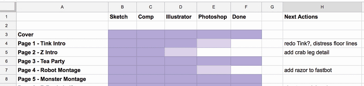
I also made a spreadsheet to track the progress of each page. Each line in the sheet showed which stage the page was in: sketch, drawing, final rendering, etc, similar to a Kanban board. A\Next Actions\ column showed if there was anything blocking the progress of that page, like needing to find reference photos for some detail. Seeing the progress of the book in this view was a big motivator. I just had to keep nudging each page towards the next stage.

This may be a more structured approach than other creative types use, but it really helped me complete the book by having these systems in place.

Monsters vs. Robots: Character Design - part 2

The character designs for the two mad scientists in Monsters vs. Robots, Dr. Tinkerton and Dr. Zadok, were made to contrast one another.

As you can see, Dr. Zadok is tall, thin, and angular, while Dr. Tinkerton is short, stout, and square.

Dr. Zadok has untamed spiky hair, like many of his monsters, and Dr. Tinkerton’s glasses are round to match the eyes of the robots he creates.

They also have contrasting background environments. Tinkerton’s surroundings are more Mid-Century Modern and retro futuristic, while Zadok has a Victorian aesthetic (verging on Steampunk).

The characters themselves share a common color palette to show that while their approach to the sciences may diverge, they actually have a lot in common.

Monsters vs. Robots: Character Design - part 1

When designing the characters in Monsters vs. Robots, I wanted all the robots to look like they were created by a single inventor. In addition to giving them the same color palette, I tried to create a family resemblance between the robots by giving each of them the same style of eyes and antenna. This gives them a unified look, even if the rest of their body shapes diverge.

I did the same thing for all the monster characters, who all share similar horns and eyes.

Additionally, I wanted the robots and monsters to share some characteristics, both as a way to add cohesiveness to the illustrations, as well as to show that in the end they’re not so different from one another. So I made their eyes all the same light yellow color. And while all the robots have antenna coming out their heads, the monsters all have corresponding horns.

Monsters vs. Robots: Color Choices

When illustrating Monsters vs. Robots I put a lot of thought into how the colors would help tell the story.

Early in the process I defined a color palette which I mostly stuck to throughout the book. I wanted the robots to have cool, monotone colors, with a few bright accents

In contrast, the monsters have warm, wild, and bright colors. For unity, these are the same colors used as the robot accents (their buttons, and fiddly bits).

The robot backgrounds are blue, the monsters are on red. When they are together the background is purple. (Subtle, right?)

Having a limited palette is actually creatively freeing because you’re not overwhelmed with too many options.

Monsters vs. Robots: Consistency

The most challenging aspect of illustrating Monsters vs. Robots was trying to keep a consistent visual style between the images for all 30 pages. As I completed pages I would learn new things or try new techniques that would then have to be re-applied to all previous work.

I experimented with doing things in batches, doing all the work for a specific detail throughout the book, like all the robot eyes or monster horns.

I also intentionally worked out of order so that the beginning pages wouldn’t look out of place next to the final pages.

After I had all the images “done”, I did several final passes, touching up each page to make sure the details were consistent.

Revisiting Old Work

One of the most difficult things about doing any kind of art is the constant self-criticism. You’re attempting to create art, not just because you find joy in the process, but because you enjoy a particular form of art and want to participate in it. But because it’s something in which you’ve already cultivated some level of taste, it’s frustrating that your own attempts don’t meet this level. It’s a learning curve that a lot of people, especially with something like mastering a musical instrument, never get past and they end up giving up.

And so even if you find yourself progressing in your craft, it’s hard to look at old work (up to and including last week) because you only see its flaws. It’s tempting to want to go back and just clean up that one little detail. That’s one of the drawbacks I find with digital artwork. Unless you do something dramatic like trash the working files, there’s no way to close a work off from future tinkering.

But it’s important to resist the desire to tinker with past work. For one thing, you can use it to gage your progression, and so each work can exist as a kind of stepping stone. And if you go back and modify these, you’re robbing yourself of a valuable snapshot in time. It’d be like editing your childhood photos so that they look more like you do today. It’s also symptomatic of a misaligned mindset, focused on the past. Unchecked, it can lead to a death spiral of continual editing because it will never be good enough, and there will always be some nagging little detail that you could have done better.

This form of obsession is not limited to the domain of artists. The world of computer programming is littered with examples of successful developers who created a very popular initial version of something only to scrap it and start from scratch building an improved version two. But the new version is never completed because the developer becomes so bogged down with a quest for perfection.

At this point I’m obliged to mention George Lucas, the epitome of tinkering with past work. Contrast that to his friend Steven Spielberg, who’s had a much more successful and prolific career, always moving forward with new projects. Several years ago Spielberg flirted with the Dark Side when he made the Special Edition of ET, which featured a computer animated version of ET as well as editing certain details to make them more PC. Fortunately he has admitted that this was a mistake and vowed to never modify his films again:

I’ve resigned myself to accepting that what the film was at the time of its creation is what it always should be for future generations. I’m no longer a digital revisionist.

As with life, there are no do-overs. You can only try and learn from you're your mistakes and apply that knowledge toward the future.

What's with all the Robots?

A while back I had the idea of trying to program a faux Facebook game about a robot on a journey. The “game” would do nothing except send random status messages to the user’s timeline about what their robot character was doing like, “Andrew’s robot completed the Sar Chasm mission” or, “Andrew’s robot solved the mystery of the abandoned Moon Mine”. A player would do nothing except sign up and their robot would be off on its mystical journey, sending you dispatches along the way. Your robot would complete missions, earn badges and mayorships, and other goodness. I thought it would be fun to create, in addition to poking fun at pointless Facebook games. (Fortunately Cow Clicker did a much better job at this kind of satire.)

I started thinking about what kind of website I would design for the game sign-up and figured it would feature large rotating illustrations of robots in different environments. After a few doodles I decided to see what it would be like to actually paint one rather than doing it in Illustrator or Photoshop. I was fairly pleased with how it turned out and it was really fun. I decided that doing similar works would be a bit more worthwhile than spending time developing a fake game.

In the process I began exploring the idea of creating characters and an environment that suggests a larger narrative, making images that look like they belong in a storybook. Or creating a scene that makes you wonder “what’s going on here” in a way that’s not just surrealist juxtapositions.

It’s also an artistic principle that any kind of image with another person in it is instantly more engaging than one without. And robots, being simple geometric forms, are much easier to draw than people, but you get some of the same instant engagement & empathy for free, especially by showing them doing human activities.

Just beware of the uncanny valley.