Monsters vs. Robots: Color Choices
When illustrating Monsters vs. Robots I put a lot of thought into how the colors would help tell the story.
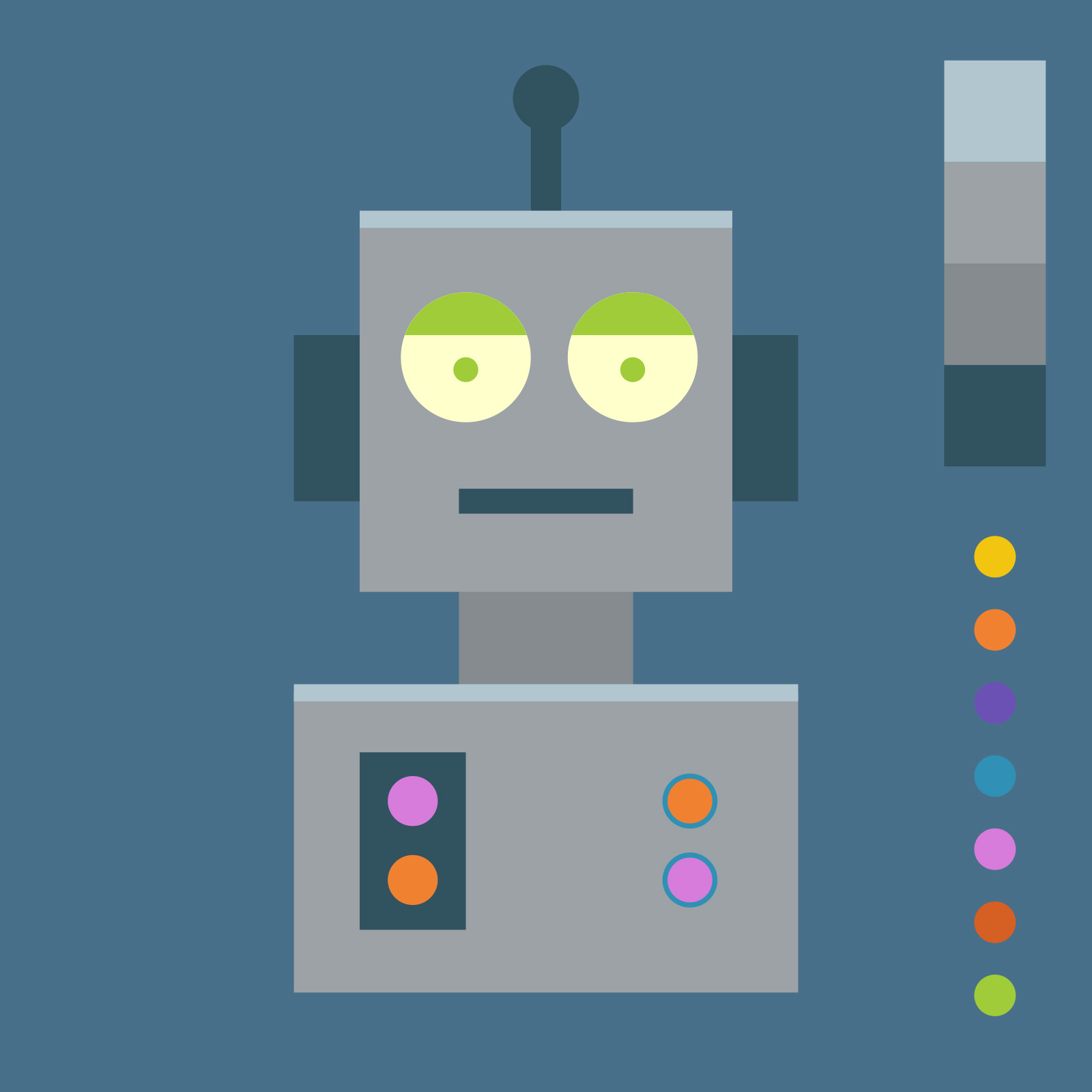
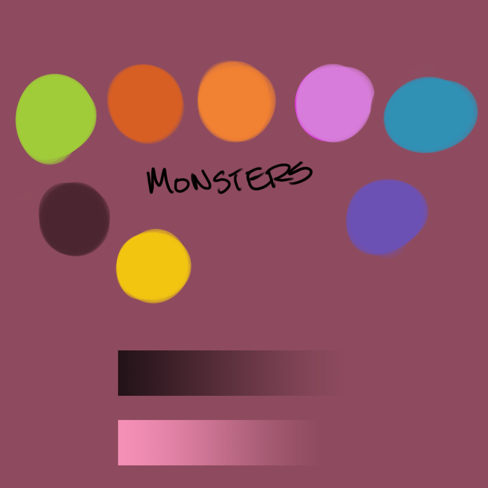
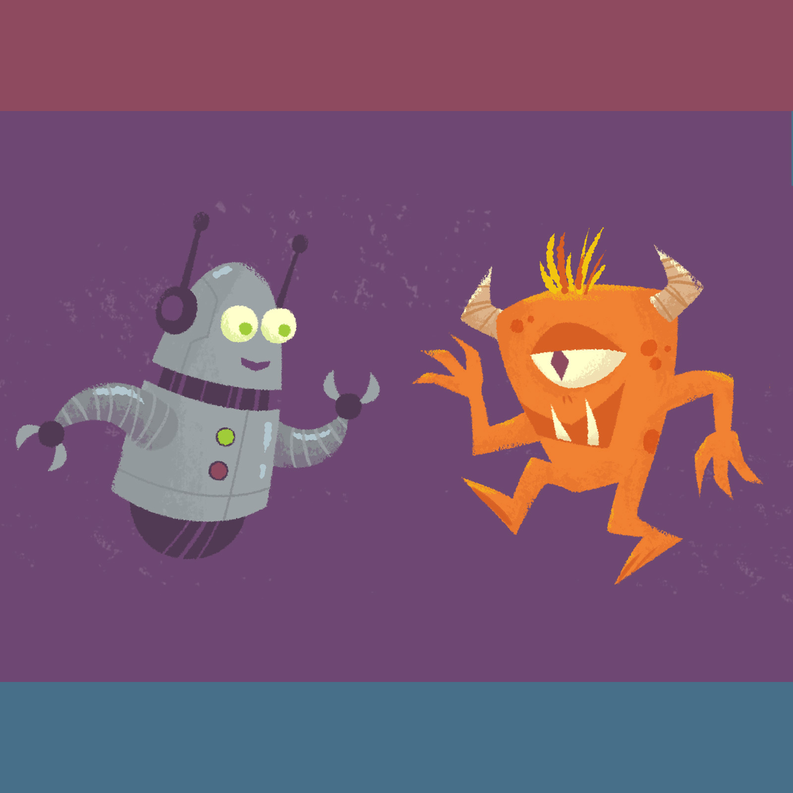
Early in the process I defined a color palette which I mostly stuck to throughout the book. I wanted the robots to have cool, monotone colors, with a few bright accents
In contrast, the monsters have warm, wild, and bright colors. For unity, these are the same colors used as the robot accents (their buttons, and fiddly bits).
The robot backgrounds are blue, the monsters are on red. When they are together the background is purple. (Subtle, right?)
Having a limited palette is actually creatively freeing because you’re not overwhelmed with too many options.