Posts tagged with "monsters-vs-robots"

Monsters vs. Robots: Getting to Done

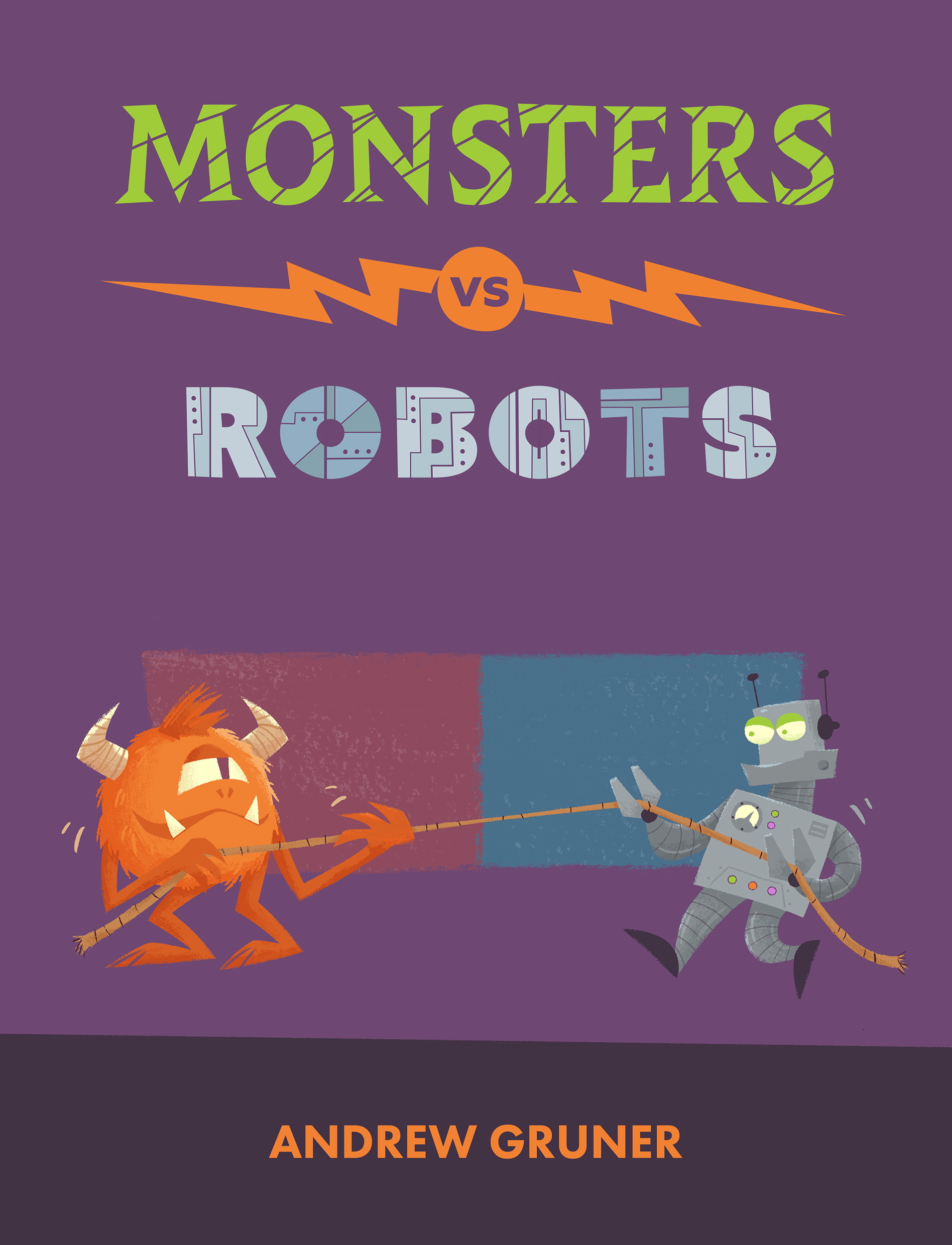
How do you finish a large project? Honestly I don’t know. I have a sizable graveyard of abandoned projects and it’s something I continually struggle with. But here are some of the processes that helped me finish creating Monsters vs. Robots.

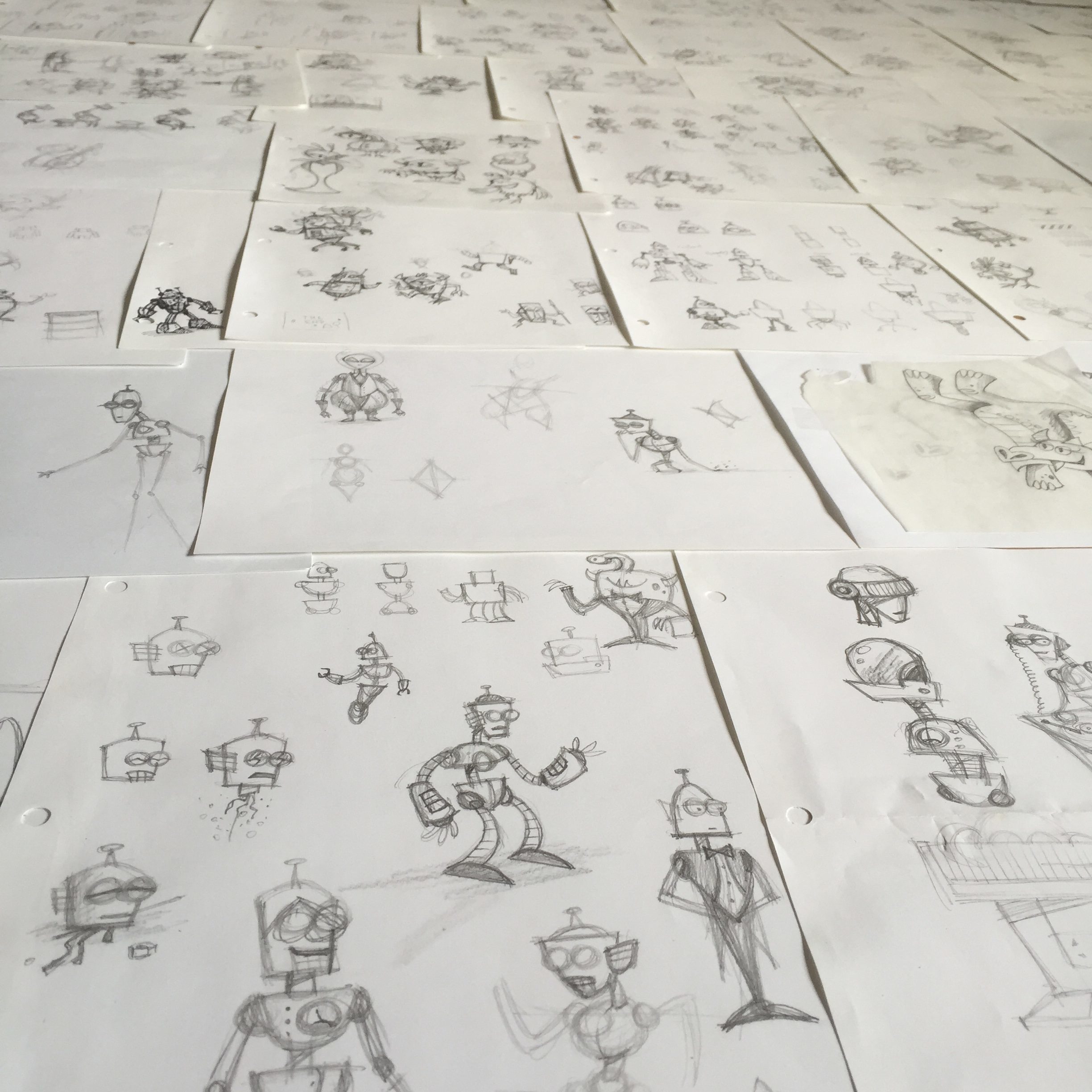
I started by doing sketches of the main characters, Dr. Tinkerton and Dr. Zadok, and I wrote a descriptive paragraph for each of them, comparing and contrasting their physical and emotional characteristics.

I should have done more research on picture book formats and standards, but instead I grabbed a few books off of our shelves and counted the pages. It seemed like anything around 30 pages would do. I wrote a basic outline for the book with a single line describing what the story should do on each page. Similar to:

1: Tinkerton intro 2: Zadok intro 3: Contest setup …

I used this outline to plot the story beats, making sure that it conveyed the dynamics of a complete story – that it introduces the characters, builds tension, and leads to a final resolution.

Then I started writing the story rhymes for each page. For some reason writing in rhyme was a lot easier than writing it in prose. (I don’t think I even tried writing in prose.)

Once I had a rough draft of the story, I laid out all of the pages in InDesign. I created a blank Photoshop file as a placeholder for each page’s illustration and linked each one to its page in the InDesign document. Then I could scroll through the whole book and start filling in the illustration details and refining the text. This gave me a framework, a giant hunk of clay to start shaping. And from InDesign I could easily export a draft of the book for preview or sharing with others.

I also made a spreadsheet to track the progress of each page. Each line in the sheet showed which stage the page was in: sketch, drawing, final rendering, etc, similar to a Kanban board. A\Next Actions\ column showed if there was anything blocking the progress of that page, like needing to find reference photos for some detail. Seeing the progress of the book in this view was a big motivator. I just had to keep nudging each page towards the next stage.

This may be a more structured approach than other creative types use, but it really helped me complete the book by having these systems in place.
Monsters vs. Robots: Character Design - part 2

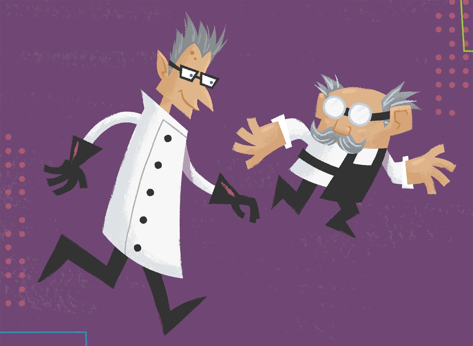
The character designs for the two mad scientists in Monsters vs. Robots, Dr. Tinkerton and Dr. Zadok, were made to contrast one another.

As you can see, Dr. Zadok is tall, thin, and angular, while Dr. Tinkerton is short, stout, and square.

Dr. Zadok has untamed spiky hair, like many of his monsters, and Dr. Tinkerton’s glasses are round to match the eyes of the robots he creates.

They also have contrasting background environments. Tinkerton’s surroundings are more Mid-Century Modern and retro futuristic, while Zadok has a Victorian aesthetic (verging on Steampunk).

The characters themselves share a common color palette to show that while their approach to the sciences may diverge, they actually have a lot in common.

Monsters vs. Robots: Character Design - part 1

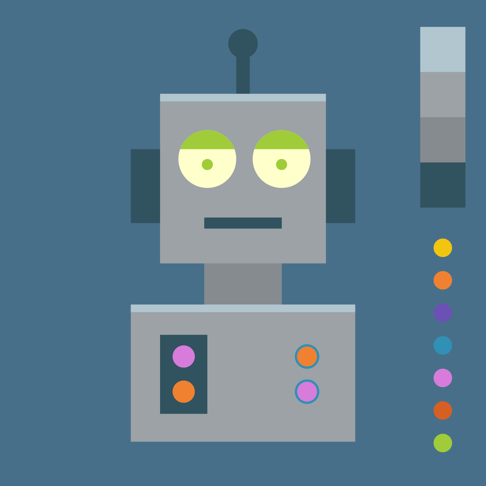
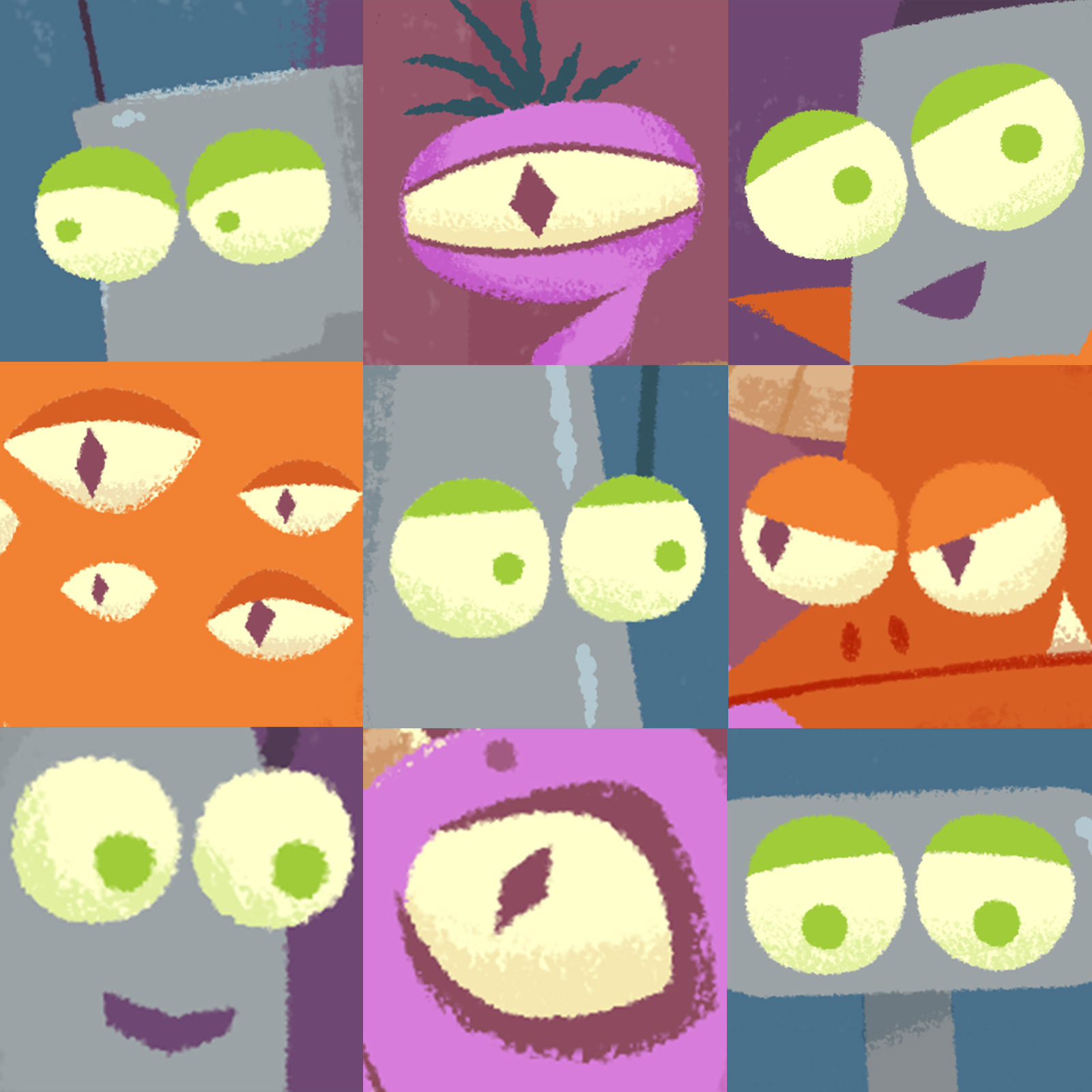
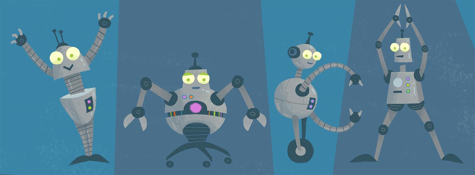
When designing the characters in Monsters vs. Robots, I wanted all the robots to look like they were created by a single inventor. In addition to giving them the same color palette, I tried to create a family resemblance between the robots by giving each of them the same style of eyes and antenna. This gives them a unified look, even if the rest of their body shapes diverge.

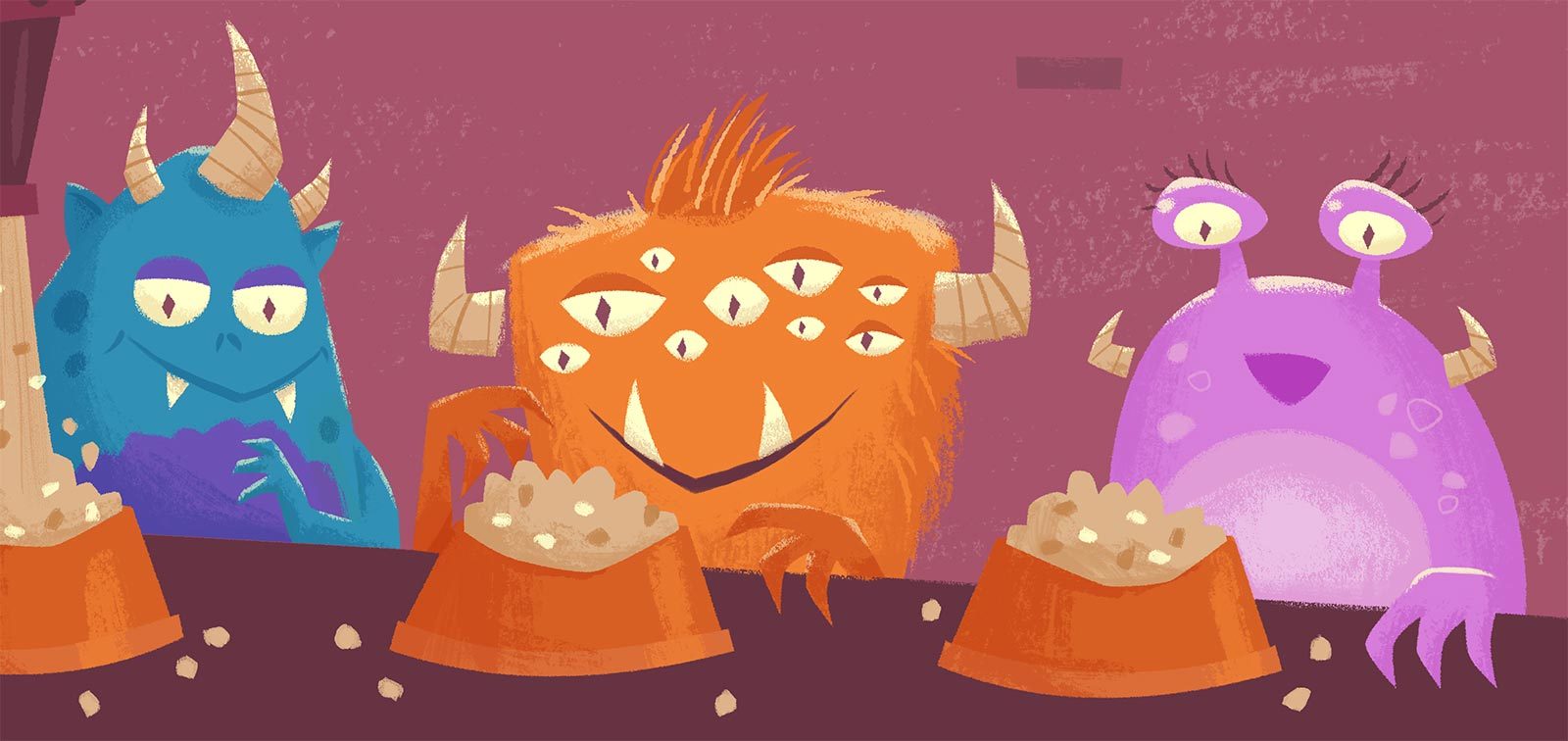
I did the same thing for all the monster characters, who all share similar horns and eyes.

Additionally, I wanted the robots and monsters to share some characteristics, both as a way to add cohesiveness to the illustrations, as well as to show that in the end they’re not so different from one another. So I made their eyes all the same light yellow color. And while all the robots have antenna coming out their heads, the monsters all have corresponding horns.

Monsters vs. Robots: Color Choices

When illustrating Monsters vs. Robots I put a lot of thought into how the colors would help tell the story.

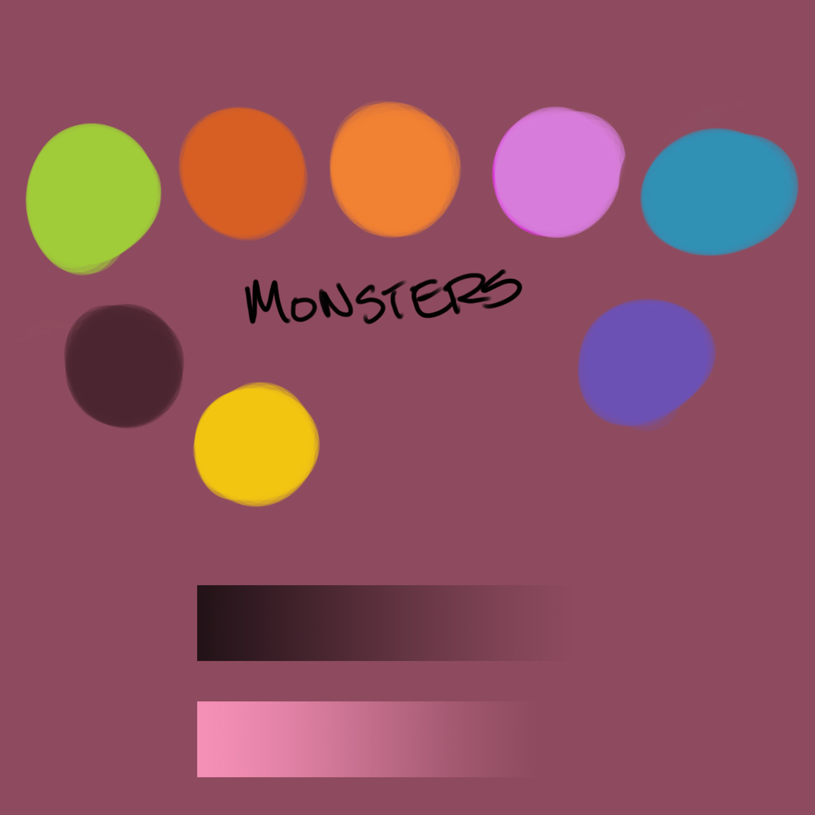
Early in the process I defined a color palette which I mostly stuck to throughout the book. I wanted the robots to have cool, monotone colors, with a few bright accents

In contrast, the monsters have warm, wild, and bright colors. For unity, these are the same colors used as the robot accents (their buttons, and fiddly bits).

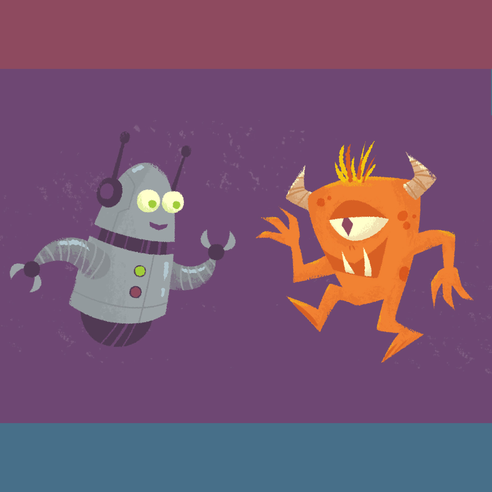
The robot backgrounds are blue, the monsters are on red. When they are together the background is purple. (Subtle, right?)

Having a limited palette is actually creatively freeing because you’re not overwhelmed with too many options.

Monsters vs. Robots: Consistency

The most challenging aspect of illustrating Monsters vs. Robots was trying to keep a consistent visual style between the images for all 30 pages. As I completed pages I would learn new things or try new techniques that would then have to be re-applied to all previous work.

I experimented with doing things in batches, doing all the work for a specific detail throughout the book, like all the robot eyes or monster horns.

I also intentionally worked out of order so that the beginning pages wouldn’t look out of place next to the final pages.

After I had all the images “done”, I did several final passes, touching up each page to make sure the details were consistent.