Fly Guy
Finished my insect warrior for this month’s Character Design Challenge. He started out as a Space Monkey alien that I’ll probably reuse.
Finished my insect warrior for this month’s Character Design Challenge. He started out as a Space Monkey alien that I’ll probably reuse.
Ha! This month’s Character Design Challenge theme is Space Pirates. A bit of a busman’s holiday for me.
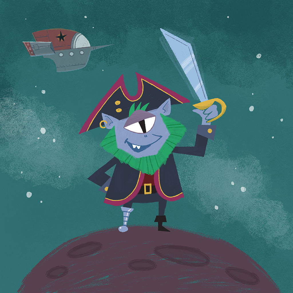
Another Space Pirates character, the chief strategist of the Space Pirates crew. Conceptually, I want him to look like a highly-intelligent lizard alien. I haven’t settled on a name.
Refining my character design for Captain Greenbeard, the leader of the Space Pirates crew.
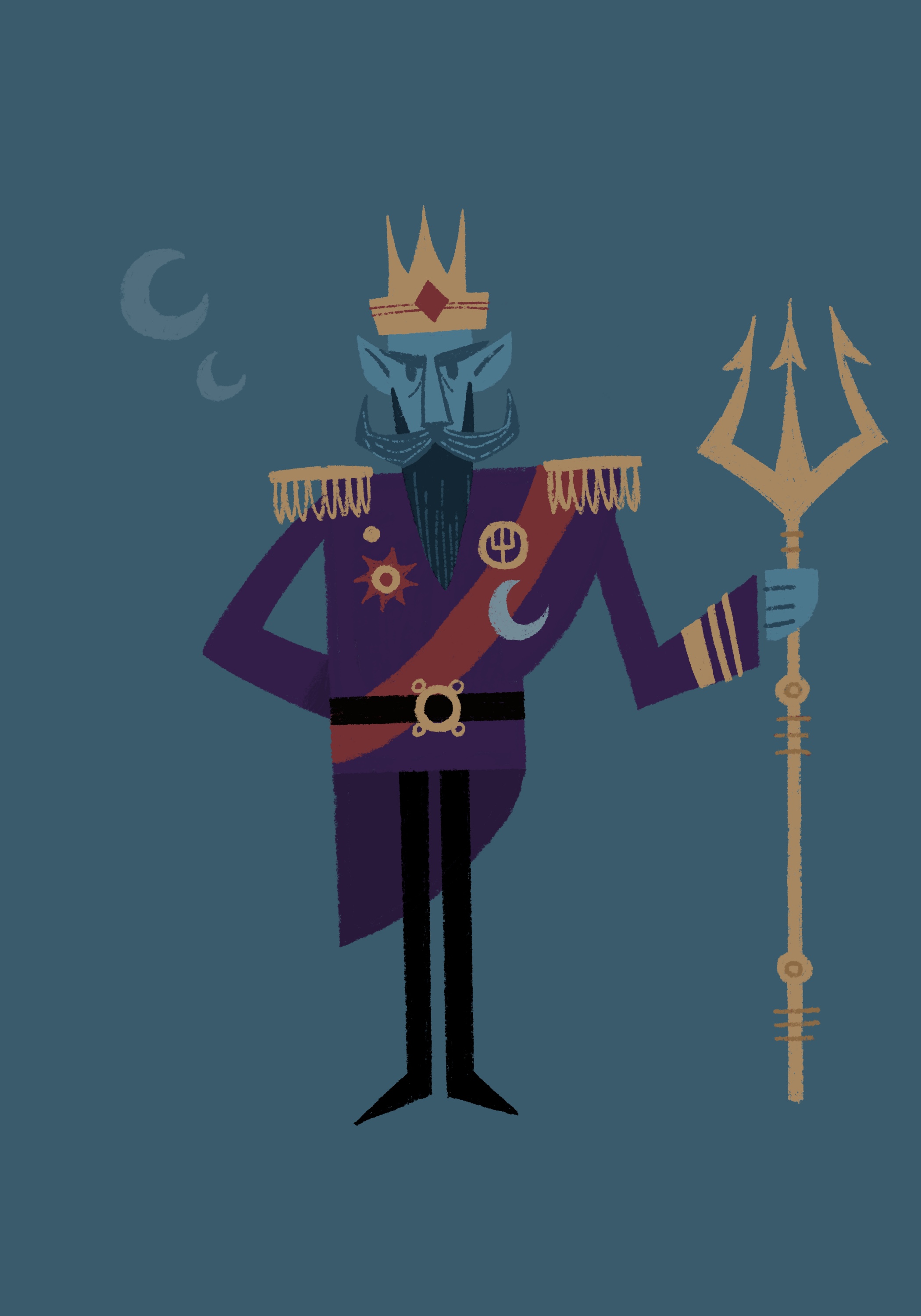
King Neptune is another character I’m developing for my Space Pirates story. He’s the stern but fair king of Neptune, and he won’t suffer pirates in his kingdom! He’s also inspired by John Roderick’s reign as King Neptune at last year’s Seattle Seafair.
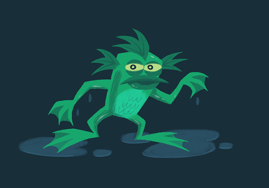
I found a doodle of this guy I did a few months ago, so I played around with rendering him in Procreate and gouache brushes from Tip Top Brushes.
The character designs for the two mad scientists in Monsters vs. Robots, Dr. Tinkerton and Dr. Zadok, were made to contrast one another.
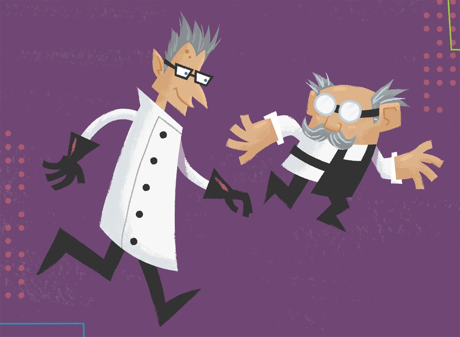
As you can see, Dr. Zadok is tall, thin, and angular, while Dr. Tinkerton is short, stout, and square.
Dr. Zadok has untamed spiky hair, like many of his monsters, and Dr. Tinkerton’s glasses are round to match the eyes of the robots he creates.
They also have contrasting background environments. Tinkerton’s surroundings are more Mid-Century Modern and retro futuristic, while Zadok has a Victorian aesthetic (verging on Steampunk).
The characters themselves share a common color palette to show that while their approach to the sciences may diverge, they actually have a lot in common.
When designing the characters in Monsters vs. Robots, I wanted all the robots to look like they were created by a single inventor. In addition to giving them the same color palette, I tried to create a family resemblance between the robots by giving each of them the same style of eyes and antenna. This gives them a unified look, even if the rest of their body shapes diverge.
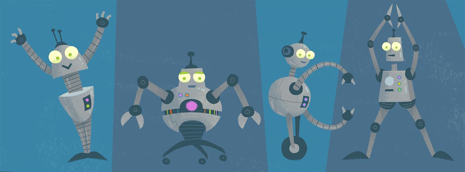
I did the same thing for all the monster characters, who all share similar horns and eyes.
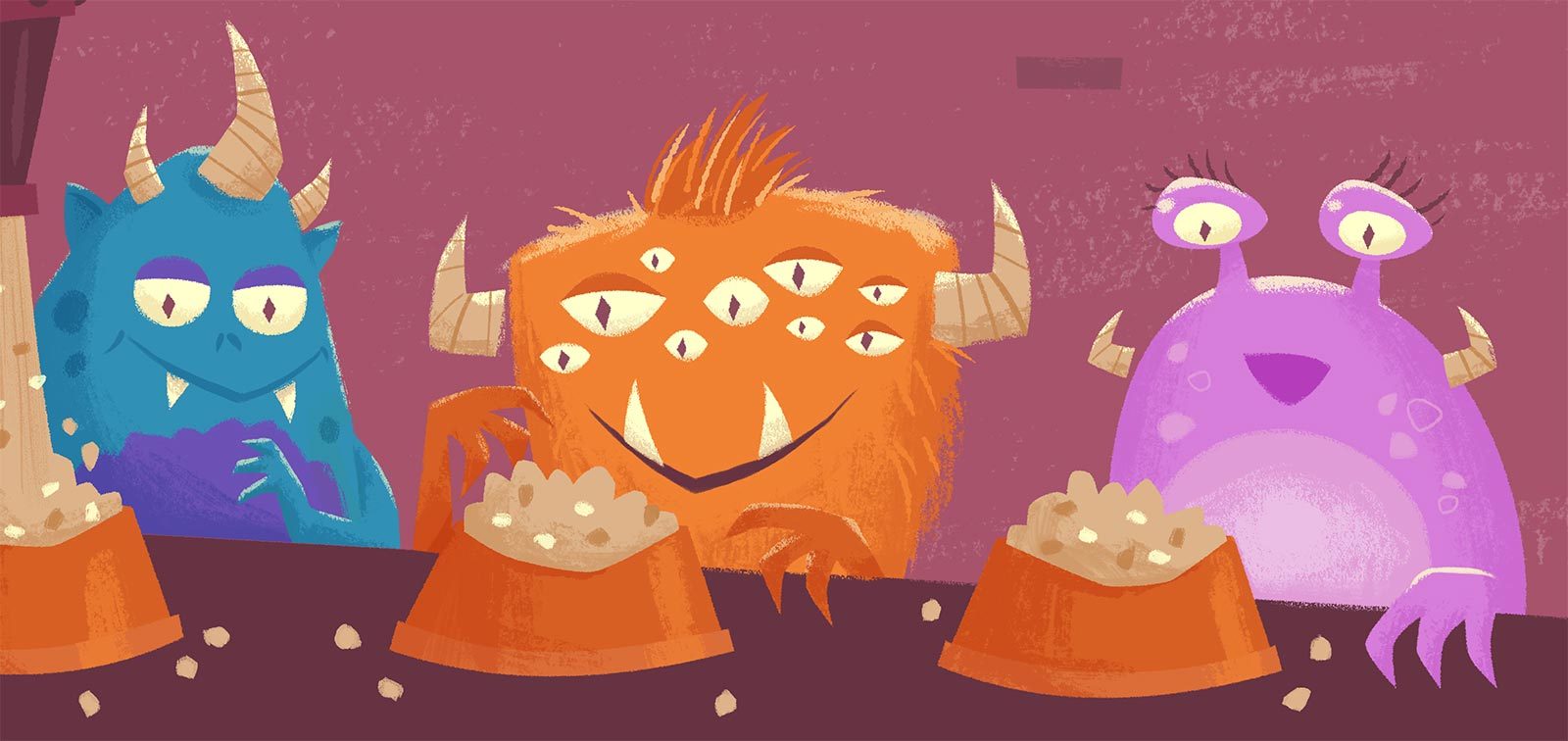
Additionally, I wanted the robots and monsters to share some characteristics, both as a way to add cohesiveness to the illustrations, as well as to show that in the end they’re not so different from one another. So I made their eyes all the same light yellow color. And while all the robots have antenna coming out their heads, the monsters all have corresponding horns.