Monsters vs. Robots: Consistency
The most challenging aspect of illustrating Monsters vs. Robots was trying to keep a consistent visual style between the images for all 30 pages. As I completed pages I would learn new things or try new techniques that would then have to be re-applied to all previous work.
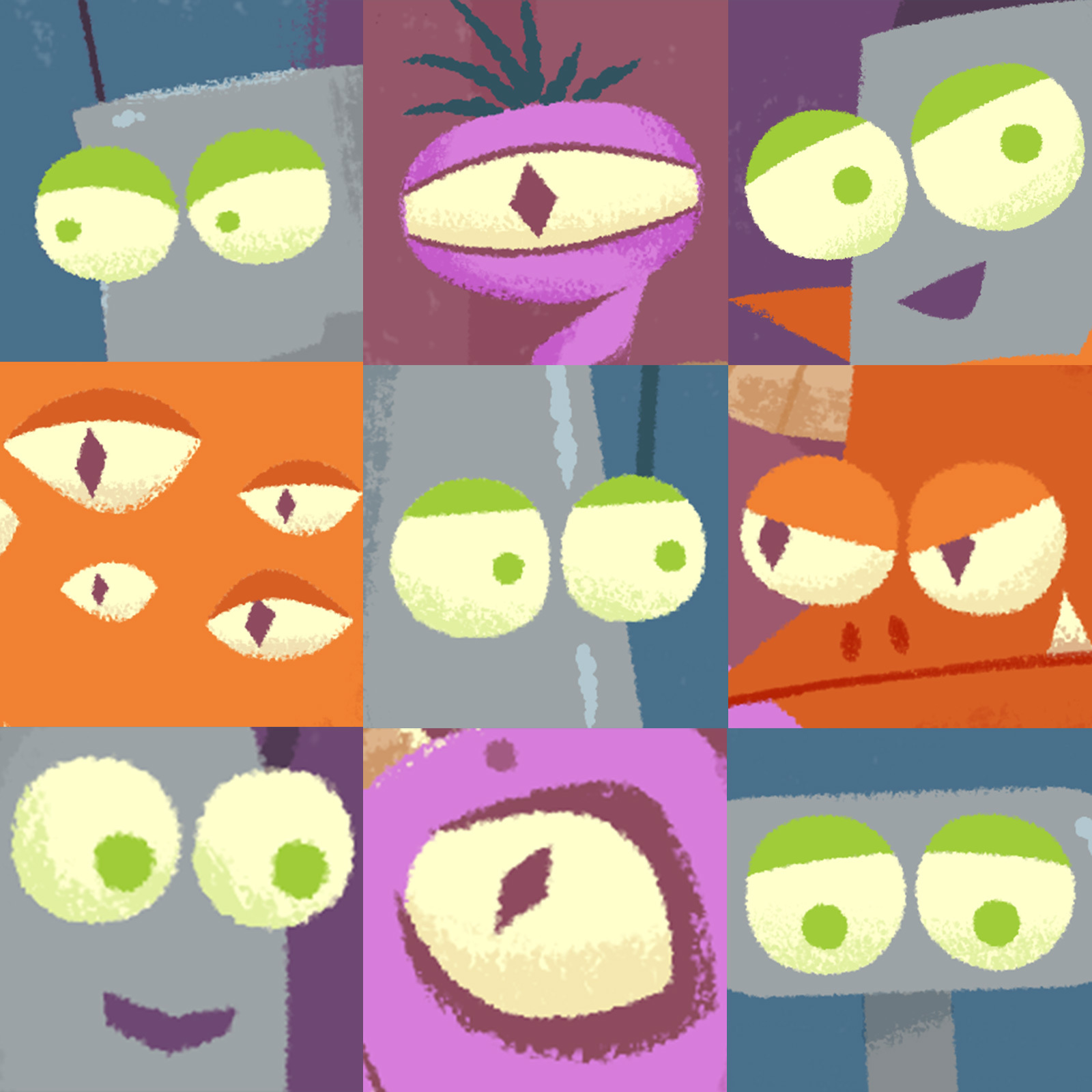
I experimented with doing things in batches, doing all the work for a specific detail throughout the book, like all the robot eyes or monster horns.
I also intentionally worked out of order so that the beginning pages wouldn’t look out of place next to the final pages.
After I had all the images “done”, I did several final passes, touching up each page to make sure the details were consistent.
